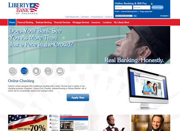
Earlier this year, Liberty Bank launched a new campaign emphasizing their honest approach to both banking and customer service. The redesign for the site needed to compliment the campaign while completely rethinking the website user’s experience—so we developed a single, responsive site that covers the same information for users, whether they’re on a phone, tablet or computer.
Rethinking the experience
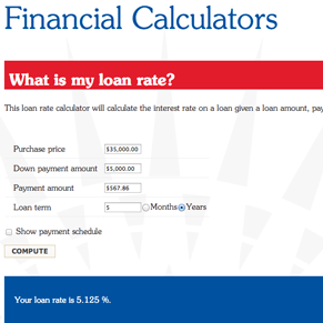
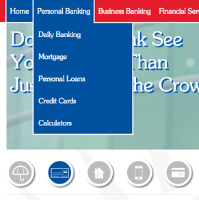
The previous site had the same structure for years, so we started this design with no assumptions and completely rearranged the primary navigation according to where a user would expect to find pages: Personal Banking, Business Banking, Financial Services, Mortgage Services, Insurance, Locations and the new My Liberty Bank page.
Each of the main areas of the site now includes sub-navigation in the left sidebar, and these links are also available as dropdown links from the main navigation. Some pages have links to access them in other sections, in addition to their normal links.
The benefit of approaching content organization with multiple points of entry for the same information is two-fold: it empowers customers while ensuring they have full access to important sections of the site.
Rethinking the community
The My Liberty Bank page has been around for a while, but it was formerly used as another login page for online banking. We reconsidered what it was and what it could be, so now it is Liberty’s hub for community interaction, housing news releases, campaign videos, Twitter feed and community pages as they come up, such as the Community Heroes page.
Rethinking mobile
Liberty Bank previously used a separate mobile site to convey information to users depending on their device. However, we designed the website so that it responsively rearranges itself for tablet and mobile devices.
Unlike most websites, Liberty Bank users have full access to the content of the Liberty Bank website on their phones. They can view information, contact Liberty Bank, sign into either the mobile or desktop online banking system, and they have full access to the Locations and Branch Locator sections of Liberty Bank.
Navigation has also been simplified and follows the same user interface patterns established by popular apps that users are already familiar with, such as Facebook and YouTube for iOS and Android.
Renovado Liberty Bank en español
Liberty Bank has made big strides to provide Spanish versions of its materials where possible. Users can easily switch back and forth between the two sections of the website. This translation was created by hand, so native Spanish speakers won’t be irritated by faulty automatic translations that feel rough.
Rethinking Liberty Bank
The overall goal of this redesign was to rethink www.mylibertybank.com and what it could be. Based on our client’s vision, we redesigned it from the ground up to make use of the content that was already established, but we didn’t assume that anything was too important to rethink.
Now, a new, cleaner website reflects the brand and empowers users. The first month since the redesign has been completed, and the site’s usage reports have been trickling in. We were nervous at first, since it was a long road from the initial redesign concept to the finished product, but the redesign has paid off in a big way for our client.