One of the reasons that I love to be a designer is that I get to make content make sense; I get to take a lump of words and a few images and turn them into a document. In turn, that document will be read by someone who intends to learn something by reading through it. Therefore, one of my measures of success is if a reader can comprehend and learn something new from a document I produced.
In order for a designer to create documents that can be understood easily by their readers, he or she must have a strong understanding of typography. Formally defined, typography is (according to Wikipedia) the art and technique of arranging type to make written language legible, readable, and appealing when displayed. The difference between readability and legibility is slight, but in short legibility refers how well the words can be seen, and readability has more to do with comprehension and how well text can be understood.
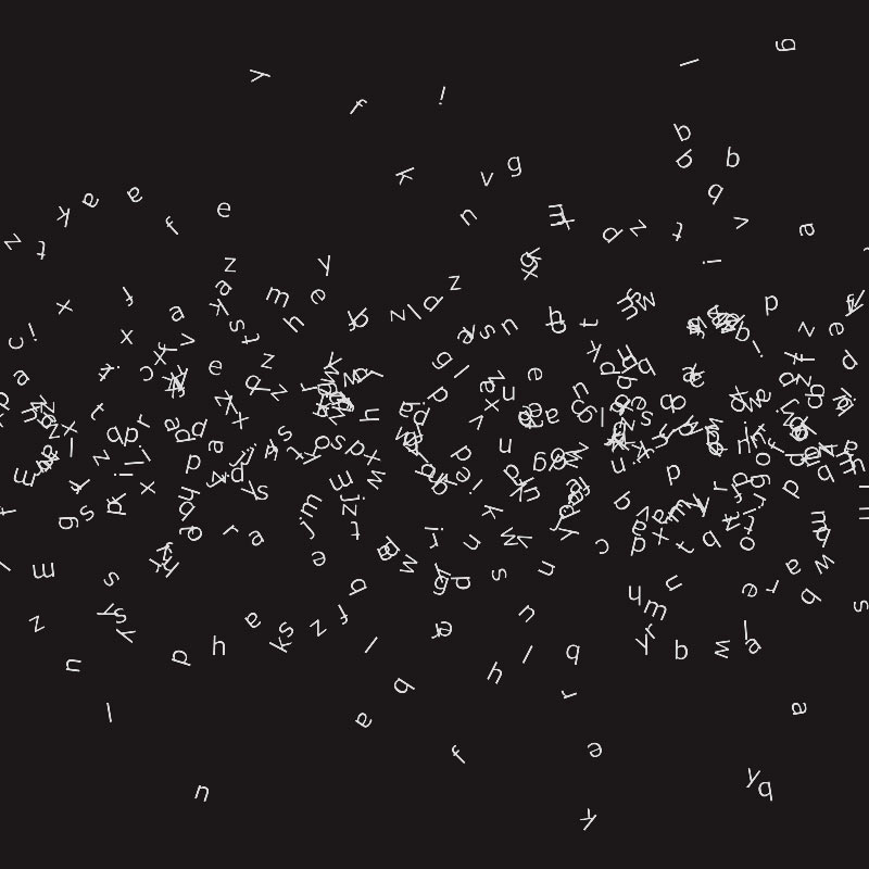
Typography is everywhere. It’s a huge part of communications of all types, in both digital and analog formats, and can be seen anywhere in which a person has chosen a particular arrangement of words. This is why so many of your designer friends will pick out issues with practically anything that has words on it — it’s everywhere and we always have an opinion.
Speaking of opinions, the following are my five commandments to be a better typographer.
I — Thou shalt know thy content.
Being a good typographer is synonymous with understanding your content. That’s because good typography reinforces the meaning of the content. Someone’s ability to produce good typography depends on how well they understand the goals of the task at hand, not on taste or training. Make an effort to understand the overall mood, structure, and voice of the content. Failing to do so increases the likelihood of designing a document that is hard to comprehend, which should be avoided at all costs.
II — Thou shalt know thy context.
A competent designer knows the intended audience of a design before they start creating. A successful designer will also take the time to understand where and when something will be read. The time and place of delivery can greatly impact the effect of a document. Experiments in context can also yield results that are far better than simply putting words on paper.
III — Thou shalt create hierarchy.
In any document, some pieces of information are simply more important to the goals of the designer and others. A good designer will understand these differences and organize them accordingly. Utilizing appropriate hierarchy can save readers time by making content scannable and can help guide readers through a document.
IV — Thou shalt respect space.
No other design technique can affect a reader’s attention more than the use of space. Like hierarchy, space helps group pieces of information into groups. There are a vast array of options to optimize: margins, number of characters in a line, space between lines (leading), space between the letters in whole words (tracking), and space between characters (kerning). This is aside from the choices of typeface, size, color, and alignment; all of which can be used to reinforce the meaning of the content.
V — Thou shalt practice restraint.
In general, the design of a document should be “out of the way” for the reader. The design decisions that a typographer makes shouldn’t negatively affect the reader’s ability to read the content. Use as little as possible — only the necessary number of fonts, colors, and sizes, and no more.
VI — Thou shalt break these Commandments.
Finally, understanding the rules allows you to break the rules. Experiment and do what’s right for you and your work.