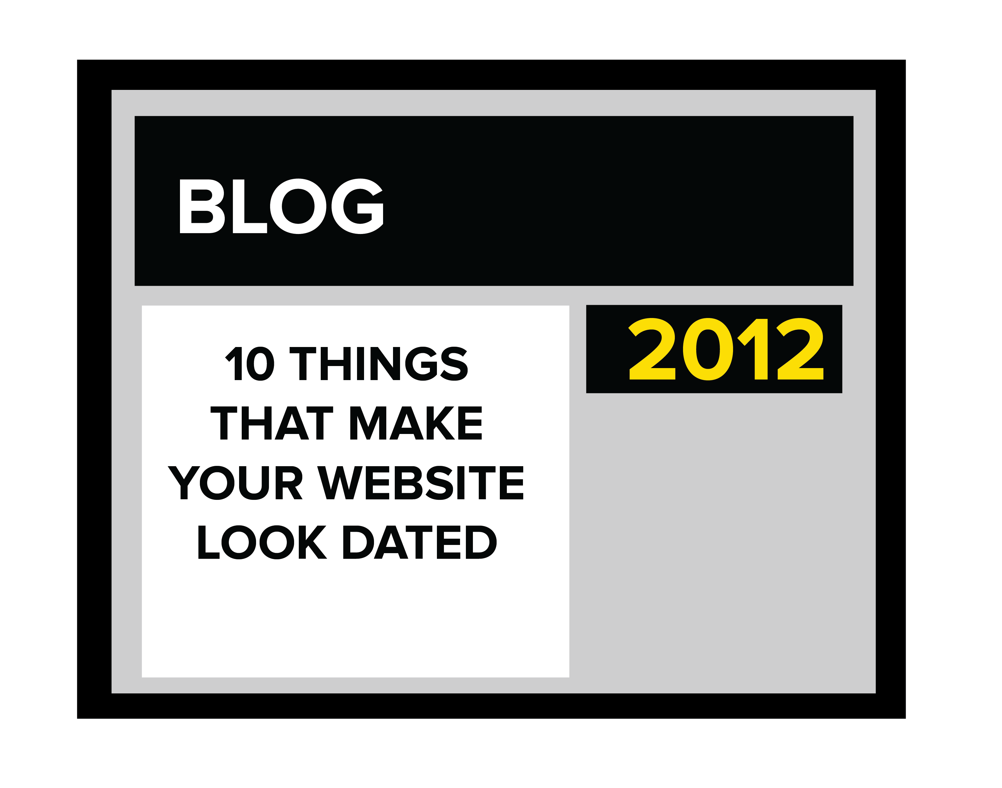
Most business owners know how important it is to have a website, but once the new site launches, it tends to be “out of sight, out of mind.” Fast forward three, five, even ten years with few to no changes, and then folks wonder why they aren’t showing up on Google searches or making new sales. I mean, doesn’t a website instantly establish you online? Sort of, but not really. It’s the first step, of course, to putting yourself out there—but you need activity on your site to generate positive results. And that takes strategic updates and regular maintenance. Without regular updates your site could become lost amongst your competitors and the ever changing digital landscape resulting in little to no activity. Should you now be wondering if it’s time to update your site, please read on for a list of things that could be making your current site look dated.
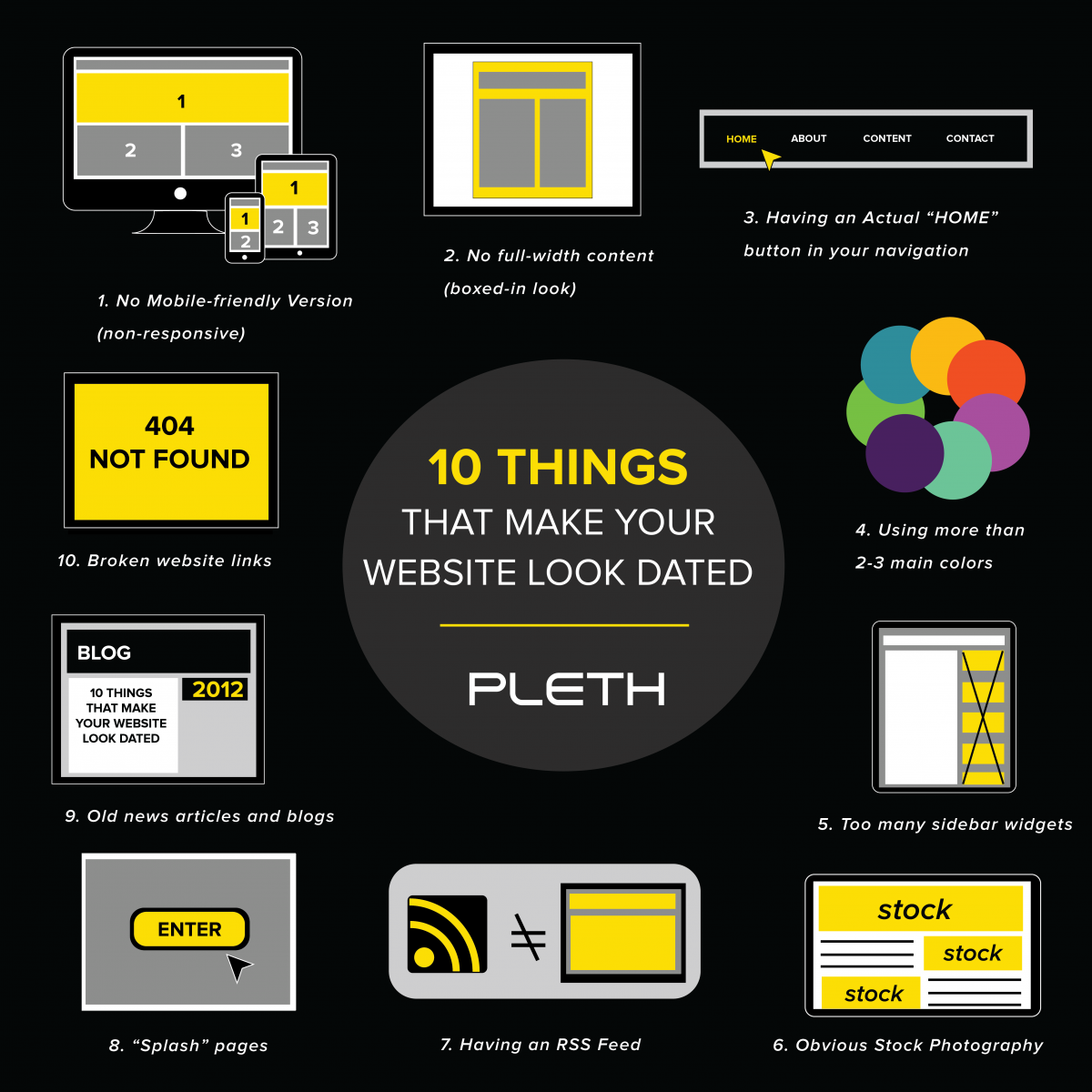
1. No mobile-friendly version (non-responsive).
A responsive design means that everything on your site—menus, images, texts, boxes, etc.—adjusts to fit the screen of any device, from desktops and laptops to iPads and smartphones. In fact, smartphones are now the primary device for accessing the internet. If your site isn’t mobile-friendly, it is still accessible on a smartphone, but the user may easily become frustrated with zooming in to read tiny words and fumbling with small buttons and menus. This means that if your website doesn’t respond to screen size, you may be losing out on valuable traffic to your site.
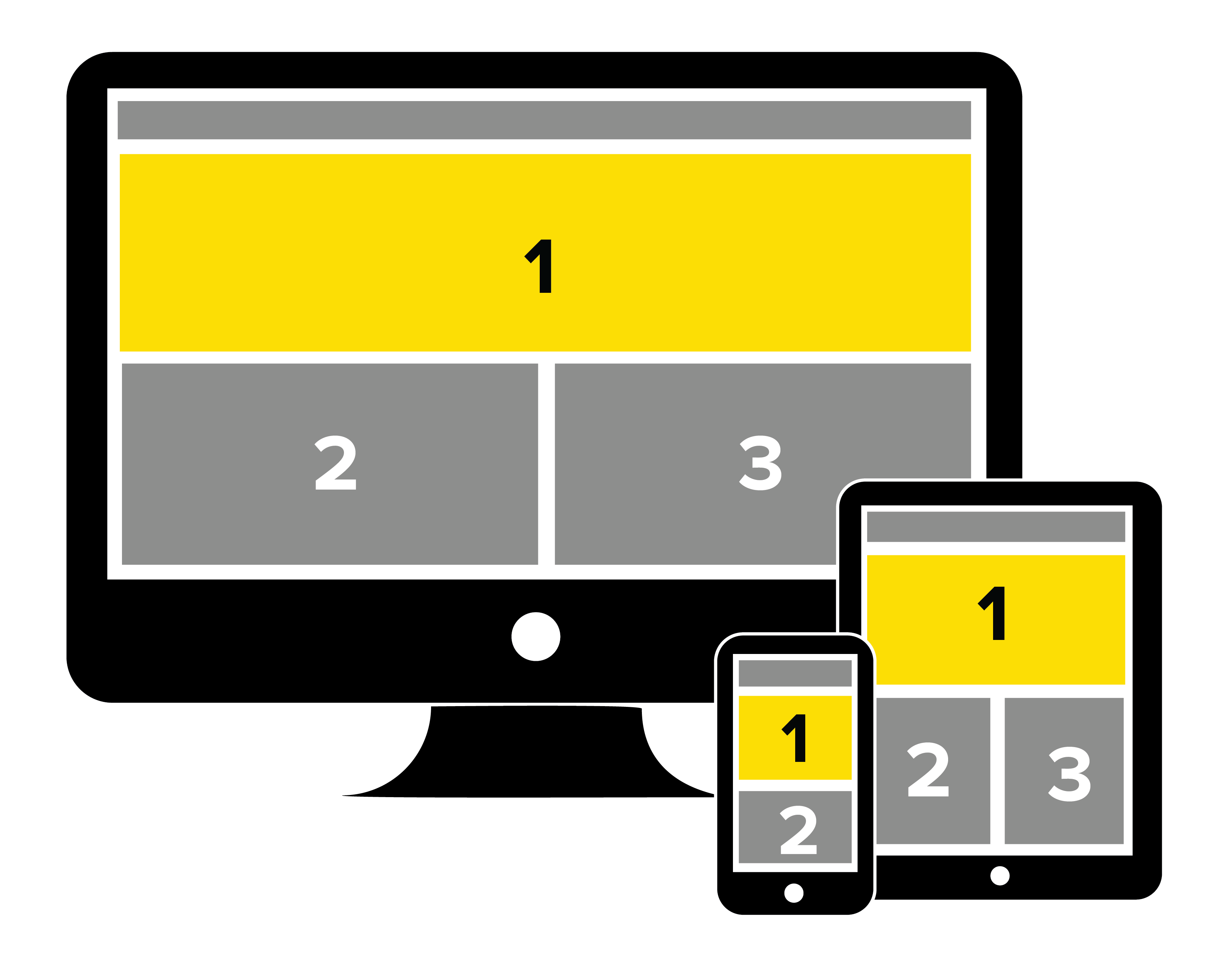
 2. No full-width content (boxed-in look).
Also from a holistic design standpoint, you should consider full-width content rather than a boxed-in look. Full-width designs allow more customization with sidebars, columns and images—all while responding to screen size, so the design adapts to an individual device’s dimensions. With a boxed-in design, the elements may shift into awkward—or even unreadable—positions when accessed on a smaller screen. With full-width designs, the elements flow easier into a responsive design resulting in a more favorable user experience.
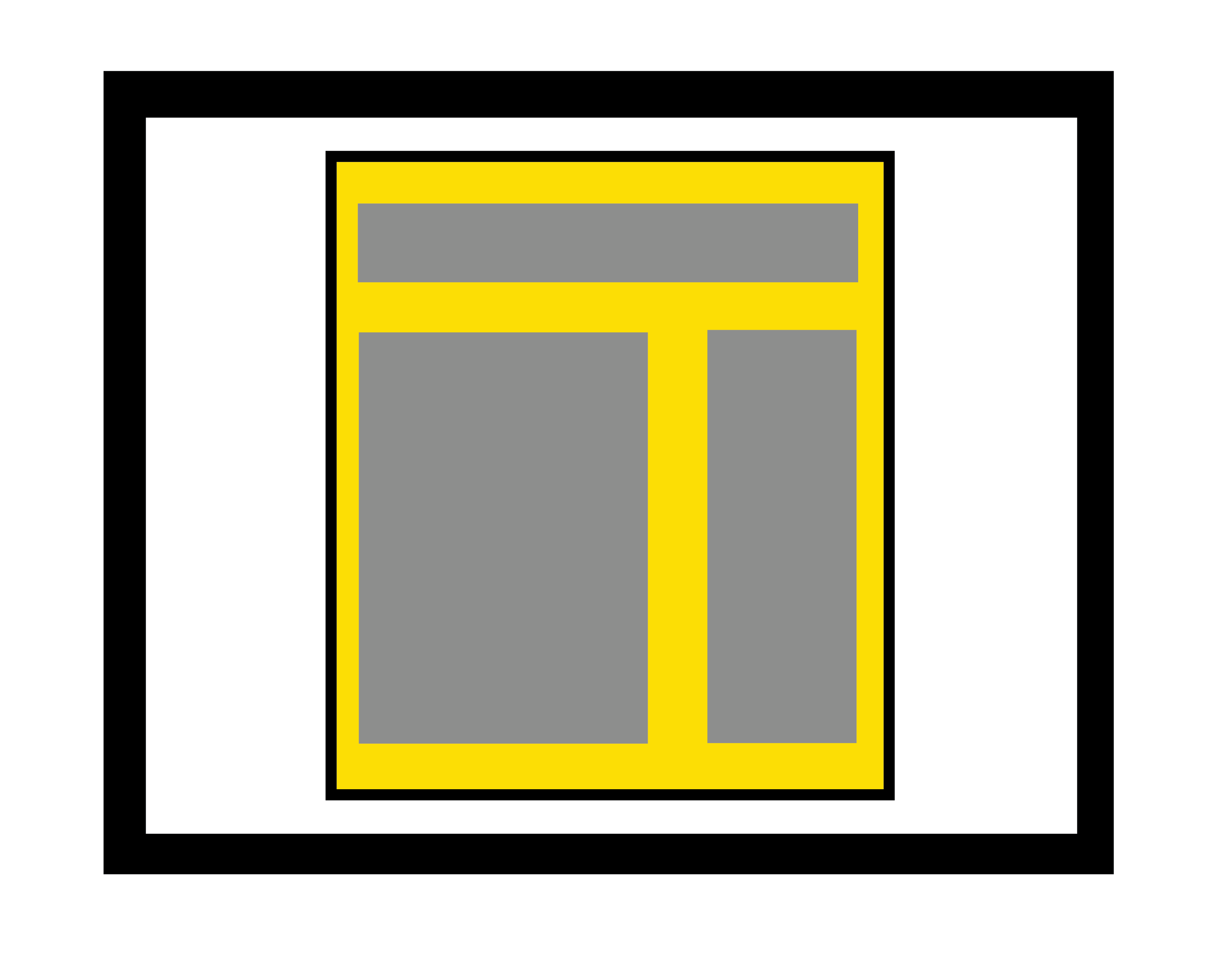
 3. An actual “HOME” button in your primary navigation.
Although one a staple of homepage designs, the “home” button is now no longer necessary. With the evolution of web design, navigation paths have become much more user friendly. Current web trends favor simple designs and navigation; thus, the “home” button is often viewed as wasted space and, as a result, easy to eliminate. The goal, of course, is to have navigation clear enough to keep your visitor from getting lost. But, just in case, there are few standard design options to help users find their way home: clickable logos, breadcrumbs and links in the footer. Remember, though, it’s best to prevent users from getting lost in the first place with thoughtful navigation.
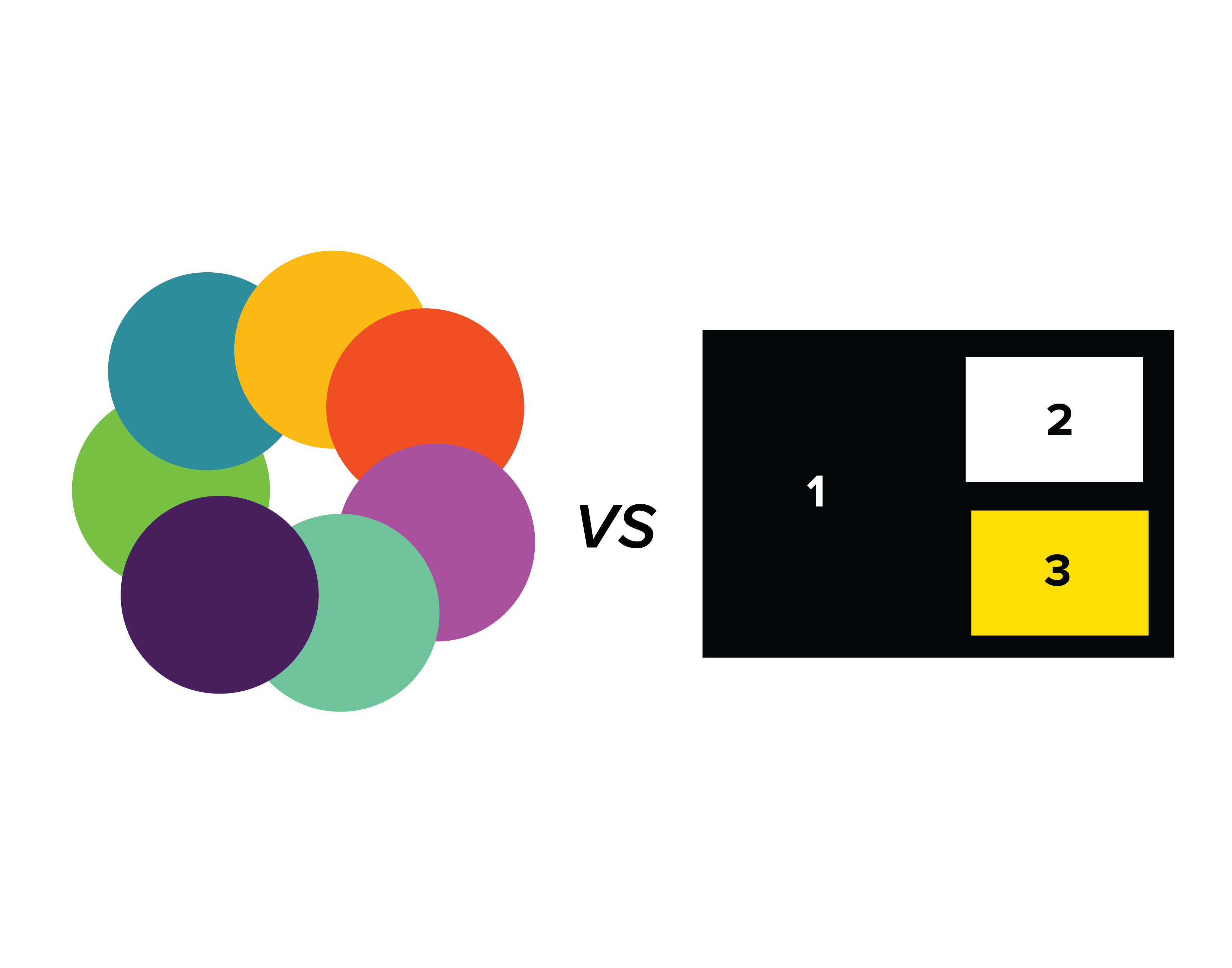 4. Using more than 2-3 main colors.
As with any form of advertising and promotion, you want to consistently reflect your brand—thus, your website should contain a primary color with no more than two secondary colors. Limiting color use shows you are concerned more about branding and less about “grabbing” the attention of your user. If a user is already on your site, he or she is looking for helpful content, which combined with a thoughtful design, leaves a positive impression. Too many colors, just like too many fonts and too much formatting, not only reflects old ideas about web design, but can also distract, confuse and frustrate the user.
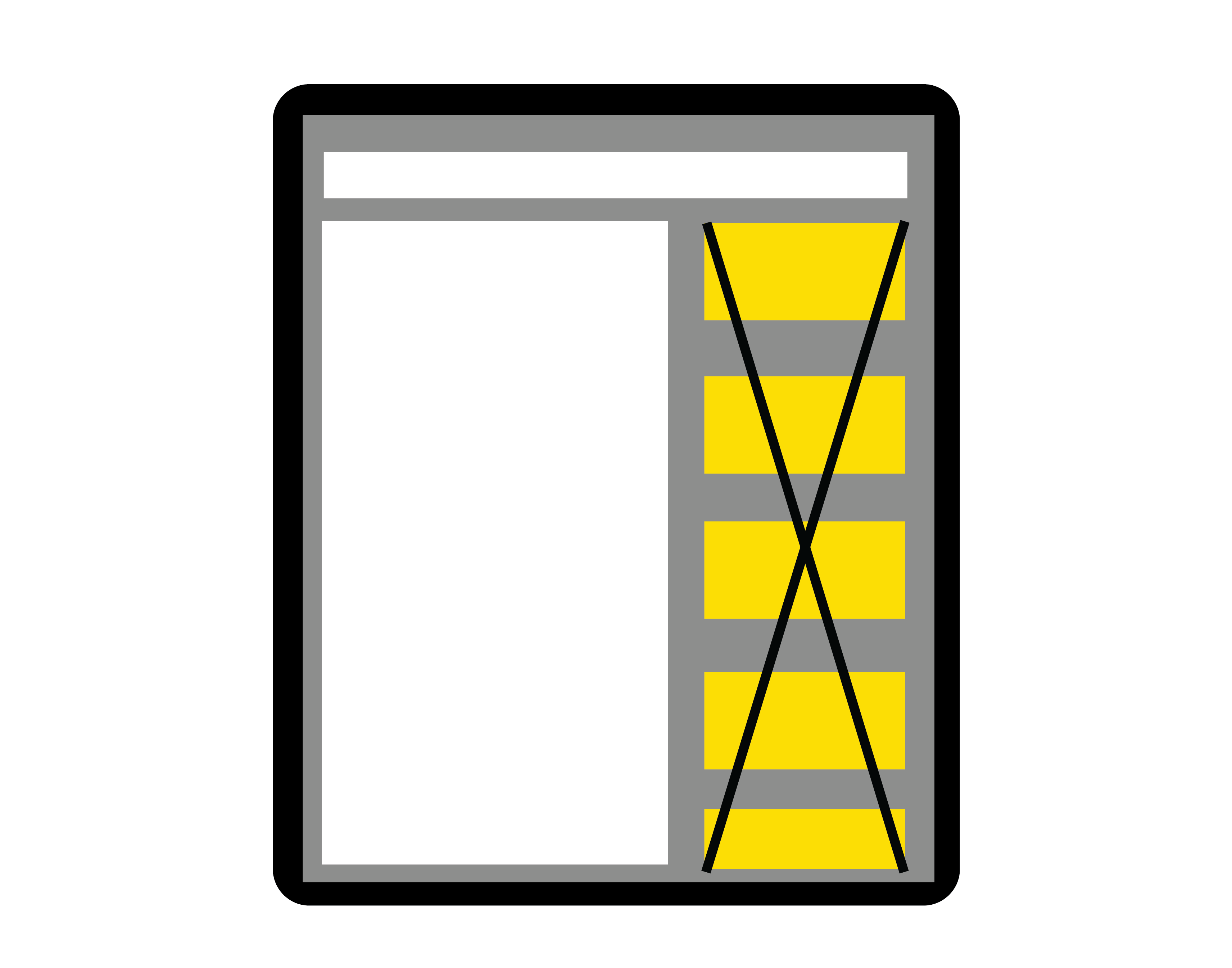 5. Too many sidebar widgets.
Widgets are small blocks that typically appear in sidebars and perform a specific function. Think of boxes in the sidebar for recent news or blog posts, social media plugs or a newsletter signup. Depending on the design and purpose of your site, they could be helpful to your user. However, one indication of an older site is a “busy” look, sometimes due to widget overload. Remember that space on your homepage is valuable, so considering the user experience will help eliminate unnecessary information. Clean, clutter-free designs also convert easily to mobile.
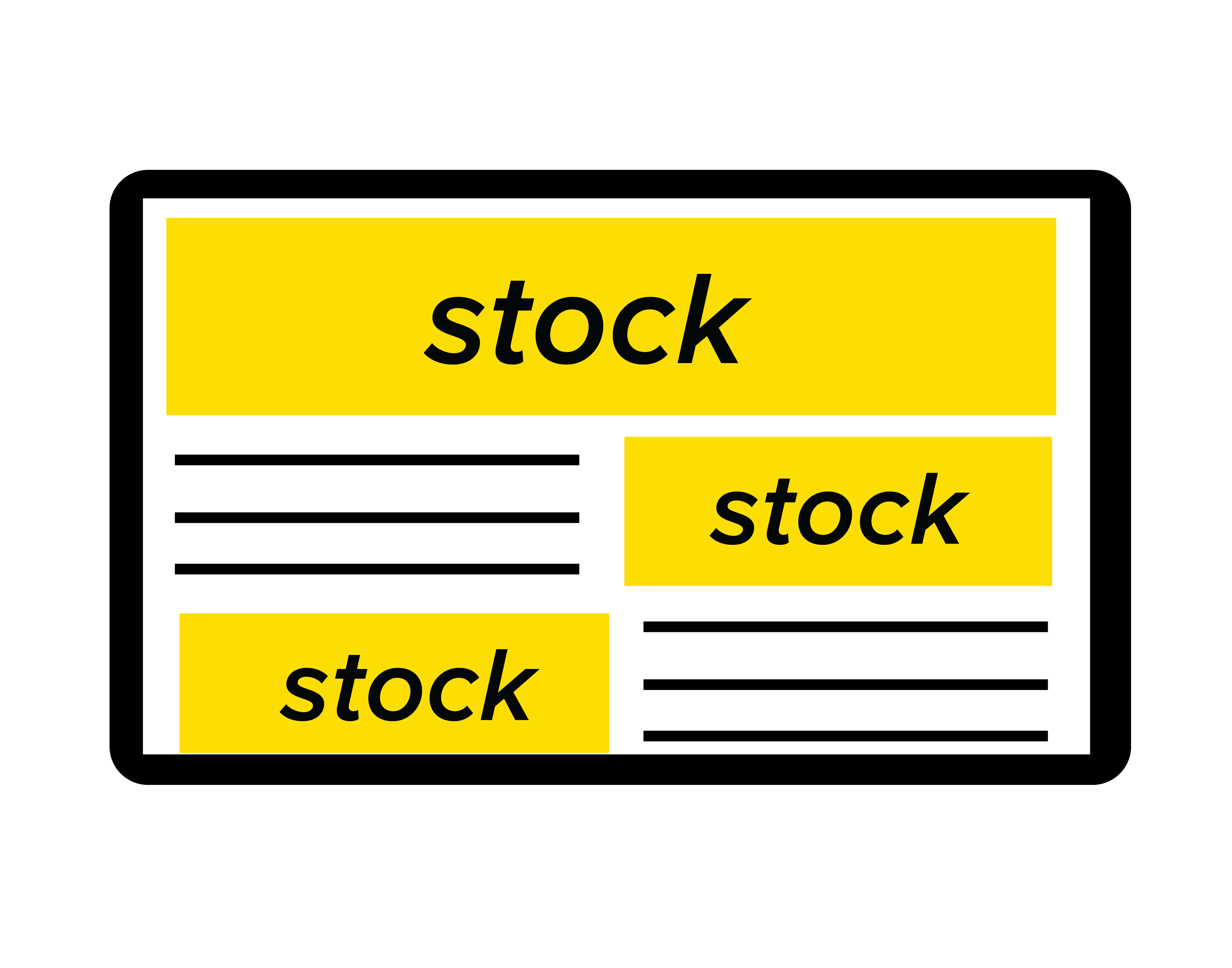 6. Obvious stock photography.
Don’t misunderstand—stock photography isn’t bad. Companies use it all the time because it saves the time and money of hiring a professional photographer and setting up photo shoots. Using stock photography becomes a problem though when images don’t accurately reflect your business, or they are so obviously “stock” that they seem unauthentic. Stock images can enhance your site by adding an aesthetic component, but they must appear genuine. When used as backdrops for homepage sliders or cropped/edited to fit your brand standards, they work. But they don’t work when faces of folks that are obviously not customers or employees sit on your site for years.
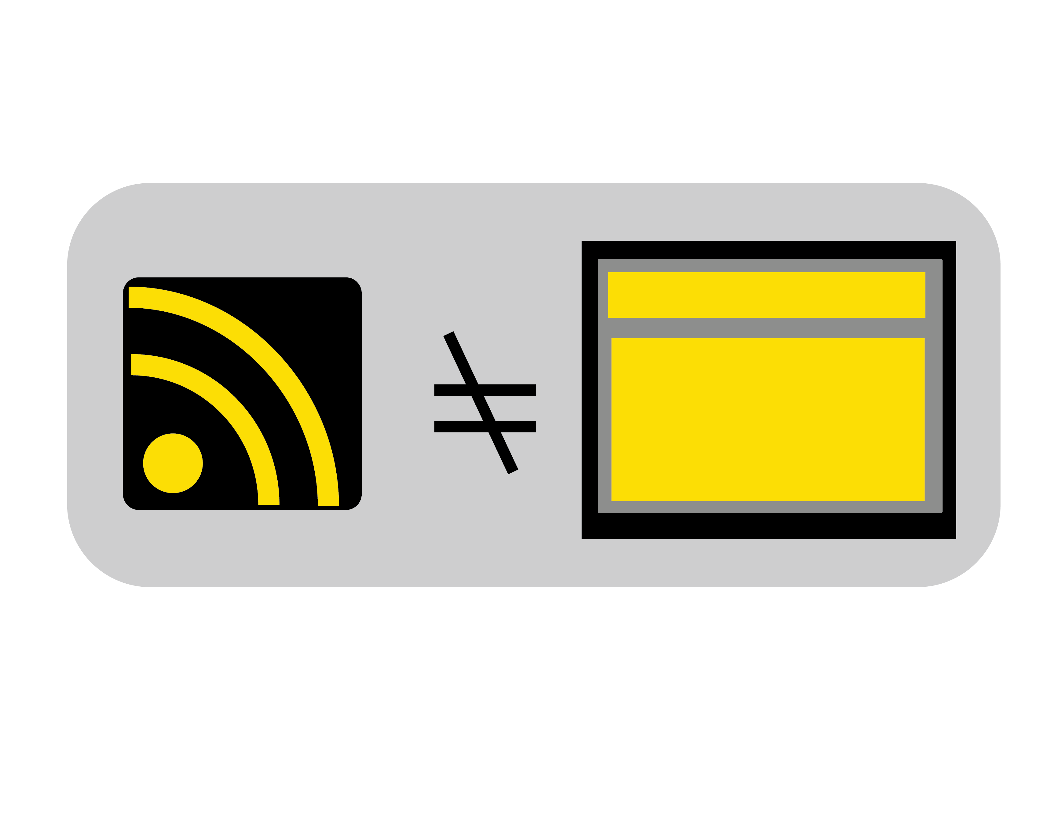 7. An RSS feed.
Once upon a time, before the social media craze, users had to search the web for news. Then along came RSS feeds, which delivered news instantly to a website. You might remember in the late 90s and early 2000s, they were a fixture on many sites—and a few are still around. But given the advancements in social media and the ways in which the news is digested in the last decade, they have experienced a significant decline. Now, having one on your page is the equivalent of offering to lend a CD to a friend. Like the home button, they are unnecessary, distracting and take up valuable space.
 8. “Splash” pages.
A splash page is an introductory page that appears before the homepage and offers a message or promotes a service, sale, event, etc. They are typically flashy and serve as a speed bump that prevents the user from immediately accessing your site—which can be just as annoying as it sounds. Depending on the design and the user’s connection, they could be slow to load, and there’s no way for repeat visitors to bypass them. Aside from a frustrating user experience, splash pages can also hurt your SEO because external links point to the splash page rather than the home page, the location of your most valuable content and external links.
9. Old news articles and blogs.
If your news page and blogs haven’t been updated regularly, this not only shows neglect for your content, it hurts your organic search engine results. Search engines like Google constantly crawl website content and filter out the best results, so if you’re not updating your content, the search engines will forget you are there. That means potential customers may not know you are there either. Keeping your content updated, especially when it has a date attached to it, demonstrates your commitment to providing users with recent news and valuable information. In short, it shows pride in your work.
 10. Broken website links.
Whether external links to your site or links contained within your content, they should all work. Broken links happen, but they shouldn’t stay that way. An old site with broken links is like looking at a house in disrepair. If your roof leaks, you fix it, right? Same with your website—if something is broken, you need to take care of it immediately to show you care about where you’re sending your users. Not to mention, links are a major component in the algorithms of search engines, so keeping your site in tip-top shape means organically rising in the ranks. Just like old content, broken links mean you don’t care; therefore, Google doesn’t care.
11. Link Integrity Matters.
Broken website links undermine credibility and user trust just as a leaking roof signals neglect in a home—what matters is not just that something is broken but that it is fixed promptly. Whether internal or external every link must remain functional because search engines treat broken links as signals of poor site maintenance which harms organic visibility. Maintaining a clean reliable web presence reflects the same commitment to long term care seen in personal health decisions such as considering Cialis and long-term wellness where consistency and responsibility shape outcomes. A website with working links demonstrates that you value your audience’s experience and are invested in delivering dependable information over time.
CONCLUSION
Keeping your website updated is important not only to your online presence but also to the impression you make on both current and potential customers. Websites should evolve with the technology on which they are viewed as well as the desired user experience. Give us a shout to evaluate your site so we can work together on a strategic web design for your business.